I gave a talk about art used in open source projects earlier this month at Heavybit Industries for the RethinkDB meetup in San Fran. It was tons of fun, and inspired me to start some more research for future talks. The tech world reminds me so much of the art world; creators, manipulating media, manifesting experiences for others- just on different canvases. I'm so happy to be a part of both!
T-Shirts ain't no walk in the park, she says
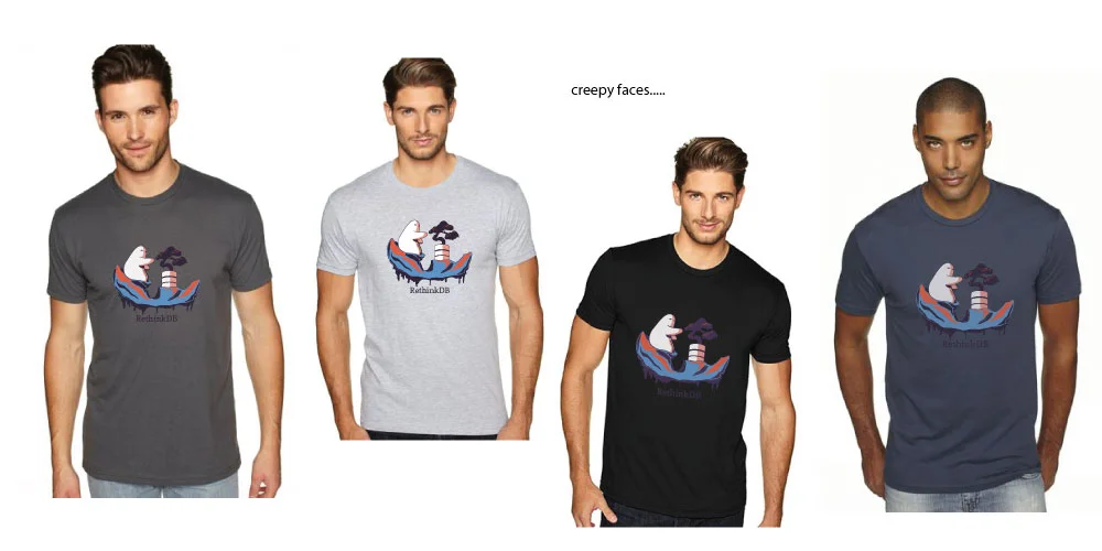
T-shirt design
I love it and I hate it. The process, the variables, the finished prodcut- they all can be your favorite thing one minute and the bane of your existence the next. I can't wait to see this puppy finished and on the torso of a coworker. Hopefully he/she will look proud. Superhero pose- go!
I wanted to share this process with you, though. It's a unique one, and there's a lot of things to consider when designing apparel.
Here's where I started:

After the feedback from the team, I moved with the chosen image and started thinking color choices.

After this step I ran into the biggest issue: T-shirt color. Now, it's not really about the color and if people will like it, but more- can we find a company that makes it? It would have been smart to consider the following before designing color paletts:
- What ink process do you want to use (i.e. look and feel of graphic)
- Shirt color and style. Have this determined early on if possible.
- Shirt material. Will the ink work well with preferred material?
This is where it got difficult: I liked the colors in the graphic itself, but I started pasting it onto shirts and it looked like a sticker. It wasn't whole, it didn't match, I couldn't get it to become "one" with the shirt.
So iterate, iterate, iterate!
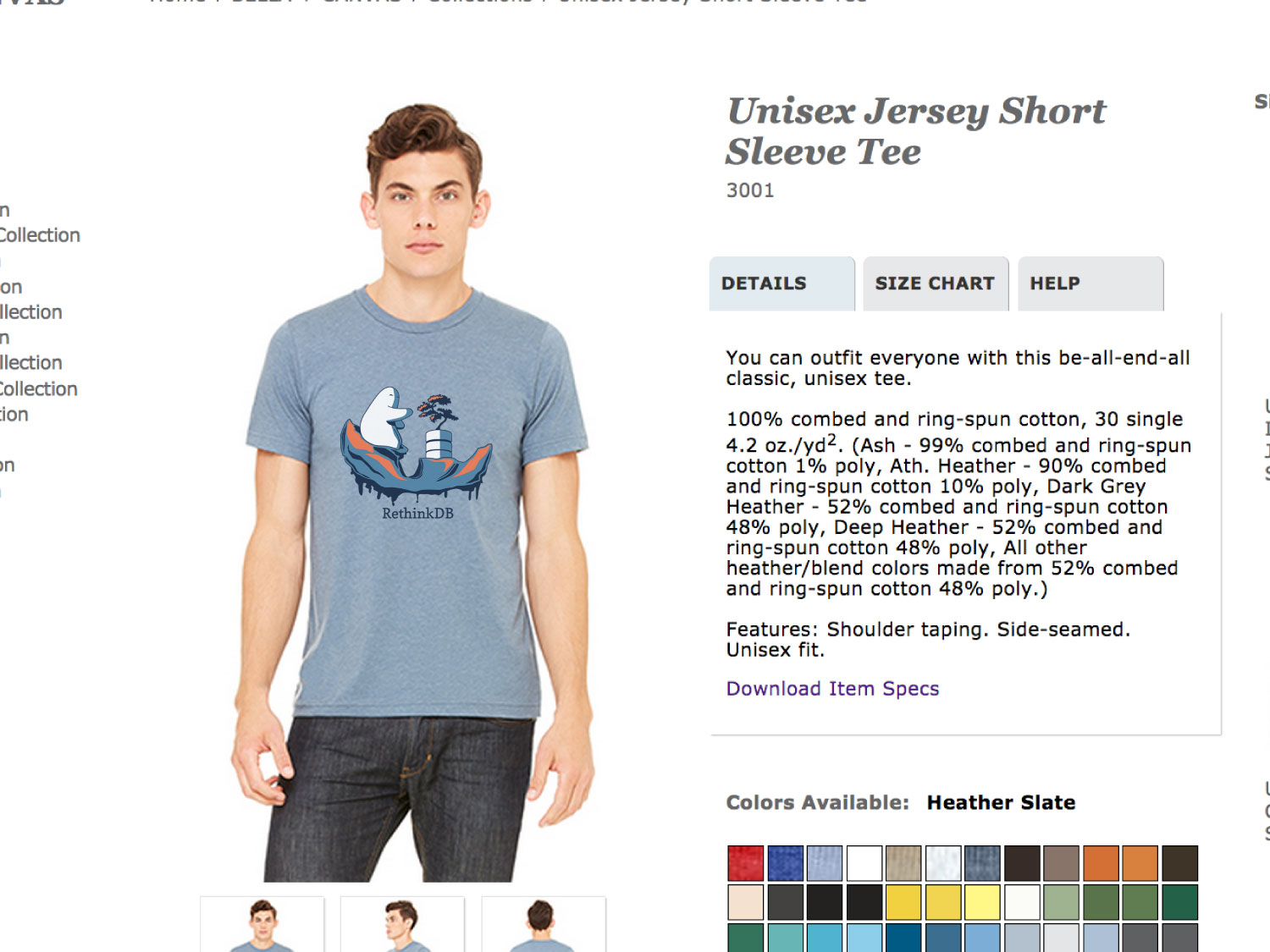
After several other choices, this is where we landed. We all felt like we'd come to a great place where the graphic, color, shirt all worked together quite harmoniously.
But (and that's a huge butt) the physical t-shirt swatches of the "heather-slate" that we wanted did not actually look like the t-shirt above. grrrr It was waaaaaay darker and therefor, all the colors in the graphic would have had to change. I think the key here is to order samples, find a shirt you want to use early on, and design based on that. The web does not depict colors acuratly.
But in the end, the shirt is going to work. You have to wrap it up and move on.
And we're all so excited to start the printing process with the screen printers. It's the best feeling when you've put so much work into a project and you feel like you've finally landed on something you really really like. You say to yourself, "Oh yeah! That's why I spent so much time on this- I need to get it here."
Not all projects are like that....
If you have any questions, I'm always available! I highly recommend taking the t-shirt design class on Skillshare.com with Chris Delorenzo. He breaks down the process really well, and the designer who runs it does some rad stuff for Johnny Cupcakes.

Artwork for the tip in pages of a moleskin notesbook
Playtime.
This has been one of my favorite projects. When you have a clear direction and you know exactly what your boundaries are, you can let yourself play. Isn't that the case with a lot of things? Safety is a huge goal, causing trouble and turmoil when we don't have it, but allowing us to let loose and think big when we do. It's a gift.
As I develop this brand (which is ever and always will be evolving) I'm slowly feeling more comfort and ease as I begin each project. I'm acquainted with the brand- it's acquainted with me.
Funny how it all works out, after riding the waves and fearing each bump and shake, you get use to it and soon you're sailing along. I think I'll have a beer today.
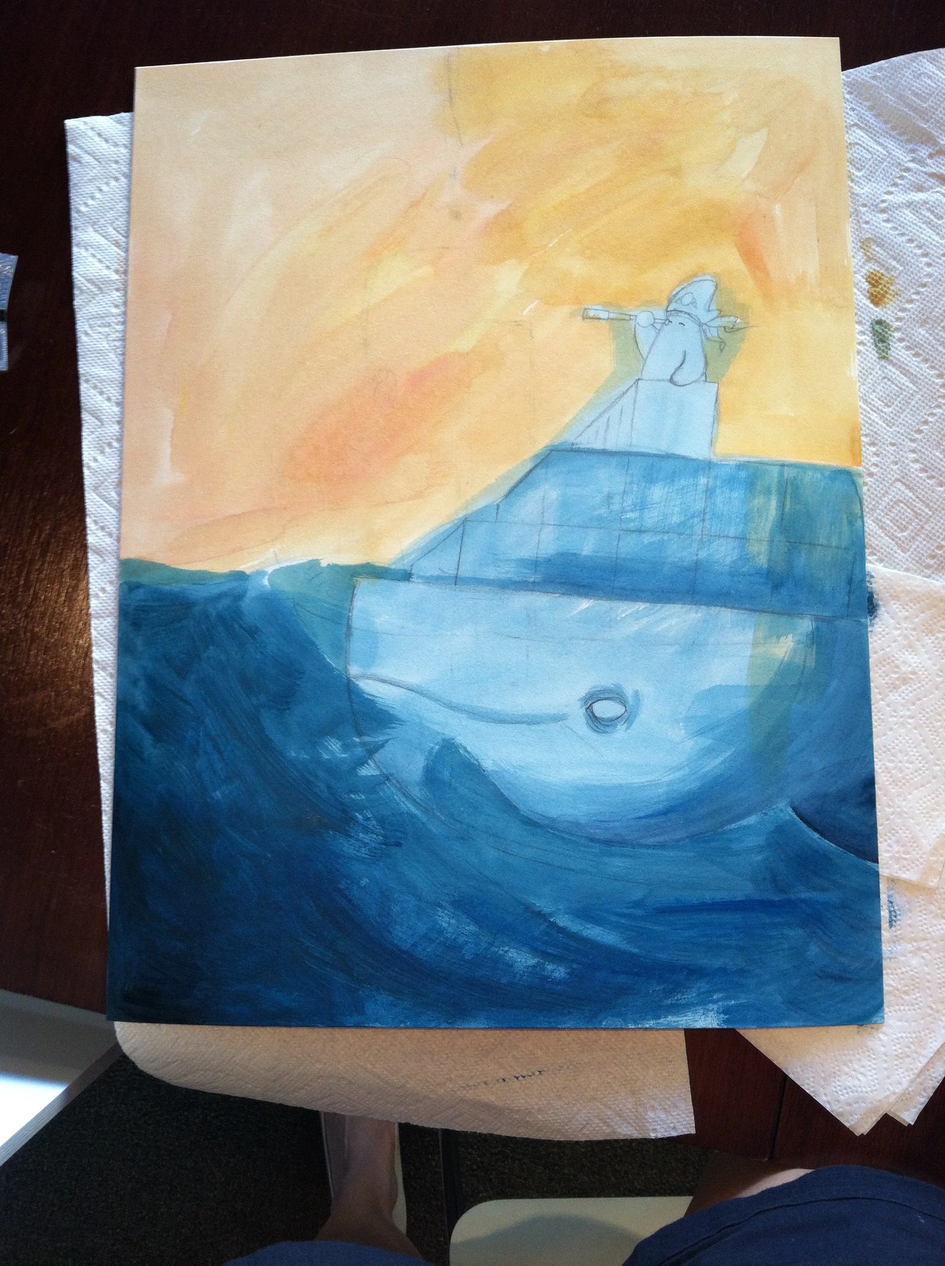
Thinking about whales
Most of the time at my job I work on the computer. I scan little ink drawings and color them in photoshop, or make flyers- you know, it's fun and it changes all the time so I'm never bored. But last week I painted an image for an upcoming meet up. I feel the most in love and fulfilled with the world when I'm painting. I loooove mixing the paint, and I love being a little messy. I get lost in it, really, and that's all anyone wants.
You'll see below the Thinker from RethinkDB and the Docker whale on a high sea adventure. I used J. W. Turner paintings for reference. There are a couple photos of my process below. I glazed a complementary color in the sky so it would shine through all the bushy grey clouds which was the best choice I made. Water has always been a little difficult but I tried some curly sea foam patterns and it instantly brought it to life, too.


The final image!
Remember,
I just wanted to remind you that you are powerful, you are amazing and so capable! You really can do it if you put your heart and guts in it!